How awkward would it be if someone referred to you by your characteristics and not your name? That would indeed be very bad, right. Just like your name is the identity you have developed over the years, a logo is an identity any brand develops.
The “four rings” of Audi, the “swoosh” of Nike and last but not the least, the famous “half-bitten apple” of Apple Inc. are all logos that have stuck by their brand for ages and after all these years, one simplest mention of these symbols will automatically trigger the brand in our minds.
Such is the power of effective branding and a well-designed logo. Hence, getting the logo right is highly important. There are various components of a logo, which should be kept in mind while designing a logo:
- Color
- Symbol
- Typeface
- Positioning
Of all these components, color plays a very important role as every color has a specific reasoning, which has to resonate with what the brand has to offer. A study showed that if the logo had a colored design, brand recognition for the same would be as high as 80%.
What is your Brand’s offering?
Before you narrow down on any particular color, the first question, which you must ask yourself is what does your brand offer. Every color has a different emotion, which it provokes in the viewer’s mind. For instance, dominos uses the color red to indicate that their pizzas are hot.
Similarly, a majority of the restaurant chains use it to indicate the food being hot and spicy, like KFC, Pizza Hut, etc.
Don’t limit yourself to a single Color
There will always be a difference of opinion when it comes to this. However, in order to make your logo appealing and attractive, you may choose to have more than one color. Ensuring the correct usability of these colors are also important.
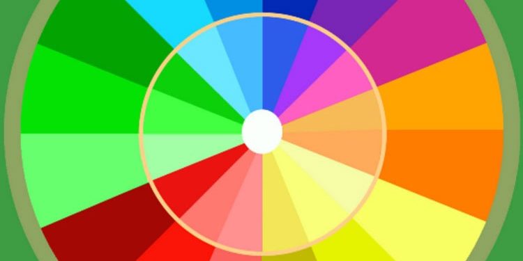
Hence, in order to do so, we have listed down some of the most important colors along with their characteristics:
- Red: This is the second most used color when it comes to logo designs. It depicts strong emotions, like, aggression, excitement, provocation, energy, and grabs the attention, quite nicely. It is usually recommended for restaurants, automobiles, etc.
- Blue: It is by far the most used color when it comes to branding. It is a very soothing color and evokes trustworthiness, faith, and positive emotions.
- Orange: It adds a pinch of playfulness, along with a vibrant appeal, and makes things look quite exuberant. It also resonates well with young brands associated with technology, youth appeal, and long-lasting relationships.
- Yellow: As the sun is yellow, this color is all about warmth, hope, and optimism. The color has an appeal, which is close to motivation and creativity. It works well for consulting agencies, art brands, and fast-moving consumer goods.
- Green: This has a robust appeal and attracts people, who love challenges and adventures. This also is characterized by material affluence, health, prestige and the lighter shades are serene.
- Black: This color has a different appeal of its own. Known to be one of the most influential colors, it works wonderfully with expensive brands. It represents agelessness, value, sophistication, and class, at the same time. It is very usual for clothing and luxury automobile brands.
- White: The purest and noblest of colors, which literally personifies calmness and innocence, this color is used to showcase trust, cleanliness, and softness. It is the number one choice for healthcare brands, along with the medical industry.
Try various shades of Solid Colors
While designing a logo, don’t limit yourself with solid colors. You can also explore a gradient appeal, or try out various shades until the logo stands out and catches the attention of the people.
Just like Apple Inc. in the beginning, starting with a logo that had the VIBGYOR elements slowly branched out into a single color, with the gradient finish to justify its premium feel, you should also try to understand whether the colors are going with the perceived position of the brand.
Over to you…
Like discussed, color is one of the most important aspects of the logo, and to get it right is equivalent to hitting bullseye as the color itself can market the brand better than the product placement and outreach campaigns for the brand on any visual medium.
And now that you know it, why don’t you try your hands on designing a logo with this newfound knowledge? Maybe, this is what you were looking for, all this while.


