Optimize Page Speed
Users tend to leave a page if it is not loading quickly enough. When a page loads slowly, it can be a source of huge frustration and also interrupts their experience. To improve your page speed, start by compressing your images before loading them onto your website. Image file size is one of the leading causes of a slow page speed.
Use Hyperlink Differentiation
Use visual cues to make links more easily identifiable. Underlined and different colored text draws the attention of the reader and lets them know the link is there to be clicked on.
Use Images
Using stock photography can decrease trust and also stand out as generic and non-unique. Using your own actual images helps you to convey your brand services and products in the way that you want to.
It also helps to create a connection between the user and the brand.
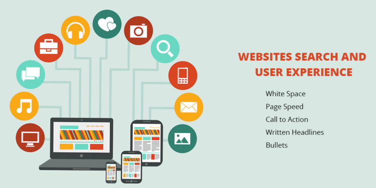
Use White Space
White space is essential to good design. There are many advantages to white space:
- Makes your content more legible.
- Enables the user to focus on elements surrounding the text.
- Makes your website feel open, fresh and modern.
However, it is vital that you find the right balance between too much white space and not enough. Having too much white space can replace some valuable information, while not having enough can make your website seem busy and can leave users finding it difficult to navigate.
Use Attractive Calls to Action
The visitors to your site are already used to using visual cues to find out which content is important to them. Calls to action that are very clearly marked with an action word that enables your website users to easily navigate your site and get exactly what they want in the location they expect to find it.
Use Bullet Points
Bullet points allow the user to quickly get all the information they want and it also helps to make your propositions more attractive.
Keep Pages Consistent
Make sure everything matches as not only is this aesthetically pleasing, but having drastic design changes throughout your website can leave your site visitors feeling confused. So, make sure everything is the same throughout, including heading sizes, font choices, coloring, button styles, spacing, design elements, illustrations, and so on.
Well-Designed Headings
Use keywords in your site as this is important for targeting your message and attracting the right audience. Search engines typically give headings more weight over other content. Employing SEO can help to optimize your chances of being noticed, go to www.clickintelligence.com for more information.
Be Mobile Friendly
It is important that your website is mobile friendly and easy to navigate, no matter what type of device is used to access it.
Check for 404s (page not found)
Encountering 404s will greatly annoy your user and makes them rethink spending time on your website. To stop the possibility of losing website users, check your website for 404s and make sure all of your users are getting the best experience.


