Every work of creation indeed has the ultimate goal of appealing to its audience. Yet, there is a subtle difference between artistic designs and commercial designs.
The difference lies in the end objective of the design itself- artistic designs are created to please our aesthetic senses, whereas commercial designs are created to sell a product.
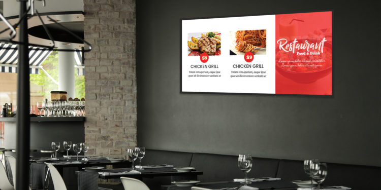
Nowadays, food businesses are moving towards a more tech-based solution to attract customers. One such solution is a digital menu board. A digital menu board is designed for the purpose of selling the food items on the menu.
Unlike a physical menu, digital menu board software allows a much higher flexibility in creating, editing, and updating the contents. Besides, it can play dynamic content (like videos, GIFs, etc.).
Naturally, a digital menu board design now yields the potential to influence a customer’s relationship with the business.
Therefore, while designing a digital menu board for restaurants, it is pertinent to have a holistic understanding of your food business.
You can ask yourself the following questions before even clicking on that design software:
- What is the type of my food business? Is it a fine dining restaurant, or a school cafeteria?
- Who are my customers? Are they mostly professionals who want their morning coffee while rushing to work? Or, small kids who are looking for the brightest color of the candies?
- What are my top-selling products? Is it a single delicacy? Or, any category of food?
Believe it or not, these questions will help you to decide your digital menu board designs right up to the finest details, such as the choice of images, the position of graphics, amount of discount, etc.
In this post, we will share some useful tips that will help you design your digital menu board for restaurants/ hotels/QSR such that ultimately your sales are improved.
5 Tips to Design a Digital Menu Board That Will Boost up Your Sales
Design to Sell, Not to Entertain
Even though digital menu boards serve to grab the customers’ attention, your ultimate motive is to sell the food on your menu.
Just because you found a lovely image of a doughnut on the internet, don’t use that picture (even as a background) unless you actually sell doughnuts.
Similarly, if you are a Chinese restaurant, don’t show the image of pasta on your menu board just for the sake of aesthetics.
Adding relevant images/videos is the first thing to keep in mind while designing your digital menu board. It helps avoid confusion and disappointment among customers.
Understand the Customer Demographic
Every business finds its favorite customer demographic, more so if it is a food business.
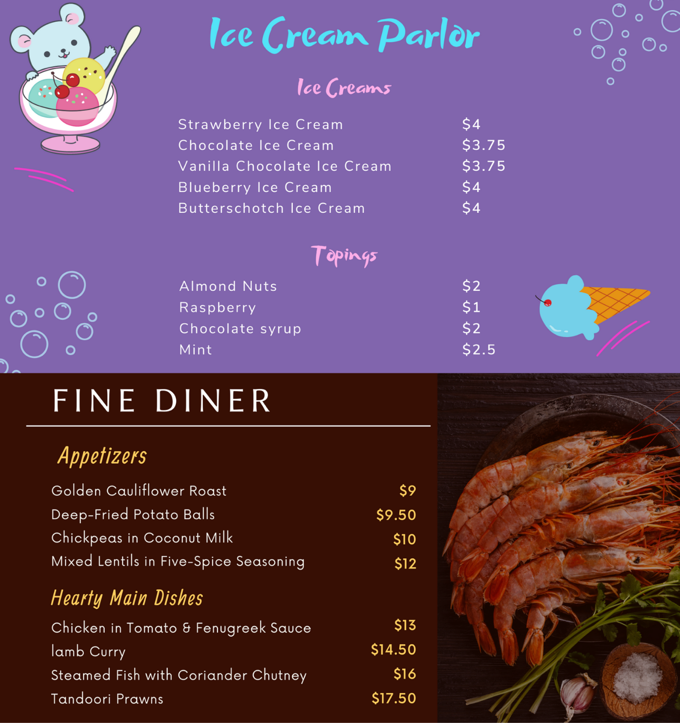
If you carefully notice, you will see that the customer demographic of an ice cream parlor is not the same as that of a fine dining restaurant. So naturally, the digital menu boards of these two types of food businesses will also be very different.
Understanding the customer demographic will help you decide design aspects like:
- Color Contrast: A warm color with shades of yellow, red, or black can be suitable for a dinner menu at a hotel bar, while the calm shades of pastel (brown, white, and peach) can be used for a coffee shop menu. On the other hand, ice cream parlors or food trucks can use bright and cheerful colors (blue, orange, pink, green) for their digital menu board designs.
- Graphics: One of the smartest ways to make your digital menu board design more engaging is to make it memorable and relevant. This can be achieved through various means such as humor or pop-culture reference. The spectrum of these means changes with the customer demographic. For instance, if you are in a school cafeteria, you can add a colorful cartoon image to your digital menu board. However, if you are a restaurant serving suited and booted people who discuss business while biting on smoked salmon and a glass of red wine, your digital menu board better not have a cartoon figure!
Here is an example that shows you the difference!

Don’t Create a Decision Fatigue
Too many options can cause decision fatigue, where customers are unable to decide between several items and finally give up. This is not a rare incident. You can often walk into a restaurant and spot someone taking a long time before ordering.
Your digital menu board can help reduce the traffic at the counter. Some of the ways are-
- Using more than one digital signage screen and splitting the menu across those screens.
- Establishing well-defined categories of dishes.
- Placing promotions and offers smartly in the line of sight and in large texts.
- Not using too many font styles.
- Not adding too many mouthwatering images of food.
- Not showing several offers on the same screen at the same time.
Let Your Digital Menu Board Breathe
Adding images and videos of mouthwatering delicacies can be a guaranteed way to attract customers into your cafe or restaurant. But, overcrowding your digital menu board with numerous images, background themes, styles, and effects can end up messing up your digital menu board.
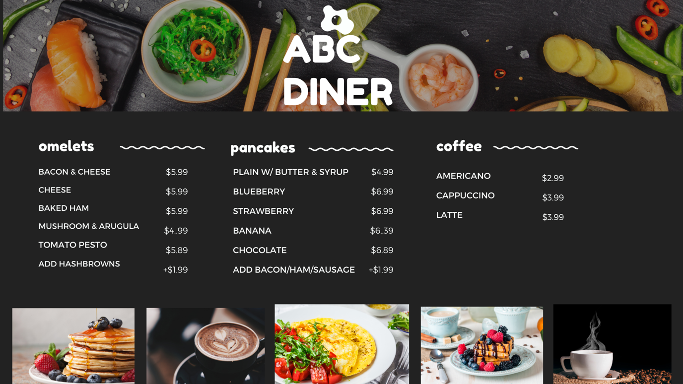
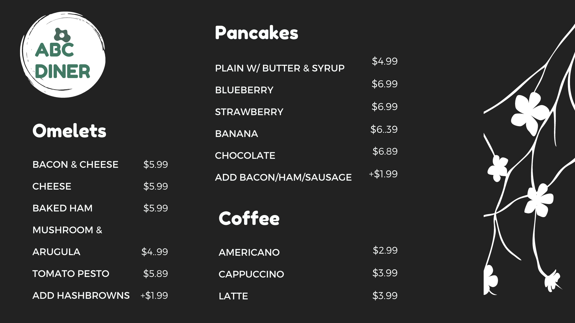
Take a look at the two images:


Although the first menu contains tons of high-quality images, it still looks unattractive and messy. On the other hand, the second menu design is much more relaxed and readable.
Too many graphics can confuse the viewers and make them lose focus on the most important component of your design, which is the text.
Throw in a Little Extra Information, Wherever Possible
An interesting way to set yourself apart from your competitors is to add on a little extra ‘something’ in your digital menu board content, besides the list of items, images, and offers.
A large section of people who eat out in restaurants, cafes, or hotels are foodies and gastronomes. Many people are also conscious about food facts like calories, ingredients, recipes, the origin of certain exotic foods, etc. Therefore, showing such information can positively impact your customers’ dining experience.
Similarly, if you are a vegetarian or vegan restaurant, you can show your restaurant’s standpoint on animal cruelty or environment-friendliness. When customers realize that a business shares their ideals and moral values, they tend to remember you less as a business, and more as a community. A small effort like this can help you carve out your niche, style and improve consumer loyalty.
Conclusion
Designing a digital menu board doesn’t have to be a nightmare. The best advice that you can take while creating any commercial design is- understand your audience. But, let’s not end without saying that it is sometimes okay to break the rules. In fact, the coolest thing about creativity is that there are no solid rules. You can be a trendsetter and also a trend breaker. So don’t be afraid to try something new. Have fun with your designs. And yes, SELL!


